BlogIndustry Guides
The Complete Guide to Chiropractor Website Design in 2026

Here's a stat that should make you uncomfortable: 77% of patients start their search for a chiropractor on Google (rater8, 2025). And according to research from Missouri S&T, they judge your website's credibility in about 0.05 seconds. That's not a typo. Fifty milliseconds.
So what happens when someone with back pain pulls up your site on their phone and sees a generic template with a stock spine image, no online booking, and a contact form buried three pages deep? They leave. They go to the next chiropractor on the list. You never even knew they existed.
I've reviewed dozens of chiropractic websites over the past year. The pattern is almost always the same: template site, page 3 of Google, zero leads. This guide covers what a chiropractic website actually needs to rank, build trust, and turn visitors into booked appointments in 2026.
Key Takeaways
The chiropractic industry generates $21.9 billion annually across more than 70,000 practices in the U.S. (IBISWorld, 2026; ACA). And 77% of potential patients find their next chiropractor through Google, not through referrals (rater8, 2025). If your website isn't showing up and converting, you're invisible to the majority of people looking for care.
The shift has been happening for years, but it's accelerated. The Bureau of Labor Statistics projects 10% job growth for chiropractors through 2034, well above average. More practices means more competition. And that competition is happening online now, not through word of mouth.
Think about how people actually behave when they're searching. According to Google's own data, 76% of people who search for something "near me" on their phone visit a business within one day. And BrightLocal and SOCi found that 80% of consumers search locally at least once a week. These aren't casual browsers. These are people with back pain right now, looking for someone who can help today.
So where are they looking? Here's the breakdown from a 2025 survey of over 40,000 patients.
Notice what's at the bottom of that list. Doctor referrals, at 28%. The old way of getting patients — "my doctor sent me" — is now less common than social media, review sites, and even AI tools. Your website isn't just a digital brochure anymore. It's your primary patient acquisition channel. If it's not working, you're losing patients every single day to practices with better sites.
At minimum, your chiropractic website needs six core pages: homepage, about or meet the doctor, services, conditions treated, contact, and online booking. According to a 2025 survey by Patient Logik, 63% of patients say they choose a provider partly based on personality fit. That means your About page isn't filler. It's one of your most important conversion tools.
Your homepage is the front door. It needs to answer three questions in about five seconds: what do you do, where are you, and how do I book? Insurance info, your star rating, and a Book Now button should all be visible without scrolling. Don't make people hunt for the basics.
This is where people decide if they trust you enough to let you touch their spine. Use a real photo. Talk about why you got into chiropractic. Mention your approach, your specialties, your personality. Are you good with nervous first-timers? Do you work with athletes? Say so. Generic bios don't build trust.
List every service you offer with a brief description of each. Spinal adjustments, soft tissue therapy, corrective exercises, pediatric care, prenatal care, sports rehab. Each service should link to more detail or directly to booking. This page also helps Google understand what you actually do.
This is your SEO workhorse. Create a section or individual pages for each condition: lower back pain, sciatica, neck pain, headaches, sports injuries, herniated discs, pregnancy-related pain. People search for their problem, not your solution. These pages catch those searches and bring in patients who didn't even know to search for "chiropractor."
Phone number, email, address, hours, and an embedded Google Map. Keep the form short: name, phone, email, message. That's it. Every extra field reduces completions.
This can be a dedicated page or a booking widget embedded throughout the site. Either way, a patient should be able to go from Google to confirmed appointment in under two minutes. We'll cover this more in a later section.
For a deeper breakdown of each page, check out what every chiropractor needs on their website.
The average healthcare website converts between 2.8% and 4.2% of visitors into leads. Optimized sites hit 7.4% or higher (InnerSpark Creative, 2025). For a chiropractic practice getting 1,000 monthly visitors, that's the difference between 3 new patients and 8. Same traffic, completely different business outcome.
So what separates a 3% site from a 7% site? It's not flashy design. It's not animations or video backgrounds. It's clarity and speed.
When someone lands on your homepage, can they see a "Book Now" button and a phone number without scrolling? If the answer is no, you're losing people in the first three seconds. Every page on your site should have a clear next step visible immediately. Not just the homepage. Every page.
Your phone number should be a tappable link on every page. Sounds basic. But I still see chiropractic sites where the phone number is an image, or it's only in the footer, or it's not even on the mobile version. One tap, phone rings. That's the standard.
Your Google star rating, number of reviews, years in practice, accepted insurance logos. Put these near the top of your homepage. When a patient has three tabs open comparing chiropractors, the practice with "4.9 stars, 200+ reviews" visible immediately wins that comparison almost every time.
Conversion rates drop 4.42% for every additional second of load time (Portent). If your site takes four seconds to load on a phone, you've already lost a meaningful chunk of visitors before they even see your content. Compress images, clean up your code, and get on decent hosting.
I've reviewed dozens of chiropractor websites and the pattern is always the same. The sites that convert well aren't the prettiest ones. They're the ones where every element has a job, and the path from "I'm interested" to "I booked" has zero friction. Pretty but confusing loses to simple but clear every time.
Want to go deeper on conversion? Read our guide on getting more leads from your website.
More than 75% of local healthcare searches happen on mobile devices (Propel Marketing, 2026). If your site isn't built mobile-first, you're invisible to three out of every four potential patients searching for a chiropractor in your area. That's not a small problem. That's most of your audience.
There's an important distinction here. "Mobile responsive" and "mobile-first" are not the same thing. A responsive site takes a desktop layout and shrinks it down. Things move around, text gets smaller, and the experience is technically usable but often clunky. A mobile-first site is designed for the phone screen first and then expanded for desktop. The difference in usability is massive.
Buttons big enough to tap with your thumb. Phone number clickable in the header, not buried in a hamburger menu. Booking widget that works without zooming. Forms that are easy to fill out on a small screen. Content that loads fast on a cell signal, not just on WiFi.
Google switched to mobile-first indexing years ago. That means Google is ranking your site based on the mobile version, not the desktop version. If your mobile experience is bad, your rankings suffer across the board, even for people searching on desktop.
And here's the behavior that matters most: 76% of people who do a "near me" search on their phone visit a business within one day (Google). These aren't casual researchers. They're people with pain who want help today. If your mobile site fumbles that moment, they're booking with someone else before they even get out of the parking lot.
Pull your chiropractic site up on your phone right now. Try to book an appointment. If any step is confusing, slow, or requires zooming, that's costing you patients.
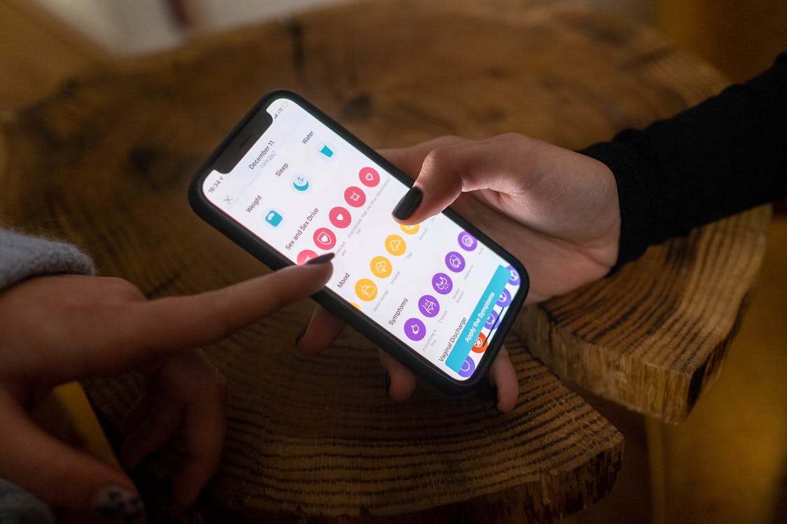
Yes. And this isn't even close. According to a 2024 study by Kyruus Health and Press Ganey, 81% of patients will choose the provider that offers online scheduling when comparing two otherwise equal options. That's four out of five patients picking the other chiropractor simply because they had a Book Now button.
The expectation has shifted permanently. Nearly two-thirds of Americans now book doctor appointments online (Emitrr, 2025). People book flights, restaurant tables, haircuts, and oil changes from their phones. They expect the same from their chiropractor. A "call us to schedule" message feels outdated. For younger patients especially, it's a dealbreaker.
You don't need anything fancy. The tool needs to show available time slots, let patients pick one, collect basic info, and send a confirmation. Jane App, ChiroSpring, ChiroTouch, and Acuity all do this well. Calendly works in a pinch. The specific platform matters less than having one at all.
Everywhere. Book Now in your navigation bar. Book Now in your homepage hero section. Book Now at the bottom of every service page and every conditions page. A sticky mobile button that stays visible as people scroll. The moment someone decides they want to come in, the booking link should be within thumb's reach. Don't make them hunt for it.
Here's something I don't see many people talking about: online scheduling doesn't just help patients. It helps your front desk. Every appointment booked online is one less phone call to answer, one less back-and-forth about availability, one less chance for a miscommunication. It frees your staff to focus on the patients who are actually in the office. It's not just a patient convenience feature, it's an operational efficiency win.
When someone searches "chiropractor near me," 42% of clicks go to the Map Pack results at the top of the page. The number one Map Pack position alone captures 17.6% of all clicks (First Page Sage, 2025). If you're not in that top three, you're fighting over scraps.
"Near me" queries for chiropractors have grown over 200% in the past three years (Omnicore, 2025). More people are searching, but only three practices show up in the Map Pack. Here's how to be one of them.
Your GBP listing is arguably more important than your website for local pack rankings. Fill out every single field. Choose "Chiropractor" as your primary category. Add real photos of your office and team. Post updates weekly. And actively ask for reviews after every appointment. We wrote a full guide on how to optimize your Google Business Profile.
NAP stands for Name, Address, Phone number. It needs to be identical everywhere: your website, your GBP, Yelp, Healthgrades, Facebook, every directory. If one listing says "Suite 100" and another says "Ste. 100" and another leaves it off, Google gets confused. Pick one format and use it everywhere.
Create dedicated pages targeting the searches your patients actually make. "Chiropractor [your city]," "back pain treatment [your city]," "sciatica relief near me." Each page needs a clear title tag, a meta description, headers that include the keyword naturally, and content that actually helps the reader. For more on finding the right keywords, check out our guide on local SEO keywords that bring customers.
This is the technical piece most chiropractor websites miss entirely. Schema markup is code that tells Google exactly what your business is, where it's located, what services you offer, and your hours. It helps Google show rich results like star ratings, hours, and appointment links directly in search results. If your developer doesn't know what LocalBusiness schema is, that's a red flag.
According to Stanford's Web Credibility Research, 75% of consumers judge a business's credibility based on its website design. Template sites save money upfront but they convert at 2-3%. Custom sites cost more but convert at 5-8% or higher. For any practice seeing 20+ new patients monthly, the math favors custom.
Here's the honest breakdown.
| Factor | Template Site | Custom Site |
|---|---|---|
| Cost | $49-150/mo ongoing | $3,000-10,000+ one-time |
| Timeline | 1-2 weeks | 3-6 weeks |
| Conversion Rate | 2-3% | 5-8%+ |
| SEO Flexibility | Limited | Full control |
| Uniqueness | Looks like 500 other sites | Built for your practice |
| Scalability | Locked into platform limits | Grows with your practice |
Let me walk through the math because this is where it clicks. Say you get 800 visitors a month. A template site converting at 2.5% gives you 20 leads. A custom site converting at 6% gives you 48 leads. That's 28 extra leads per month. Even if you only convert a third of those into patients at $300 per visit, that's $2,800 in extra monthly revenue. The custom site pays for itself in a few months.
Templates have their place. If you're a brand new practice with zero budget, a clean template is better than no website. But the moment you're spending money on ads or SEO to drive traffic, sending that traffic to a template site is like buying expensive ingredients and cooking them in a microwave. The foundation matters.
If you want to see what a custom build looks like for a chiropractic practice, take a look at our chiropractor website design page.
Costs range widely depending on the approach. DIY website builders run $49-150 per month. Template-based agencies charge $150-500 per month. Custom builds typically cost $3,000-15,000 one-time, plus $50-200 per month for hosting and maintenance (Inception Online Marketing, 2025). The right tier depends on where your practice is and where you want it to go.
Wix, Squarespace, or WordPress with a premium theme. You're doing the work yourself. It's affordable but you're trading time for money, and unless you know SEO and conversion design, the result will look like every other DIY chiropractic site. Fine for a startup. Limiting for a growing practice.
A company builds your site using a template, adds your content, and manages hosting. It's faster than DIY and looks more polished. But you don't own the site most of the time, customization is limited, and you're locked into monthly payments that add up. At $300/mo, that's $3,600 per year, forever.
A developer or agency builds from scratch based on your practice, your patients, and your goals. You own the site. SEO is built in. The design is yours alone. Monthly costs for hosting and maintenance run $50-200. Higher upfront cost, lower long-term cost, and significantly better performance.
According to Tebra (2025), most chiropractic practices spend 1-5% of revenue on marketing. Growth-focused practices spend 7-10%. Here's a simple way to think about it: if your average patient is worth $300 per visit and comes in 10 times, that's $3,000 in lifetime value. Two extra patients per month from a better website is $6,000 in monthly revenue, or $72,000 per year. Even the most expensive custom site pays for itself many times over.
Don't just compare the sticker price. Compare the returns.
DIY builders cost $49-150 per month. Template agencies charge $150-500 per month. Custom websites run $3,000-15,000 as a one-time build, with $50-200 monthly for hosting and maintenance (Inception Online Marketing, 2025). The best value depends on your practice size and growth goals.
At minimum: homepage, about or meet the doctor, services, conditions treated, contact, and online booking. If you treat specific conditions like sciatica, sports injuries, or pregnancy-related pain, individual pages for each one help with both SEO and patient trust.
Absolutely. 77% of patients start on Google (rater8, 2025), and 42% of local searchers click the Map Pack results (First Page Sage, 2025). Without SEO, your site won't appear when patients search for chiropractors in your area.
WordPress offers the most flexibility for SEO and customization. Wix and Squarespace are easier to set up but limit what you can do long-term. A custom-built site using a modern framework like Next.js outperforms all three in speed, SEO, and conversion rates. If you're serious about growth, custom is the way to go.
A template site takes 1-2 weeks. A custom build takes 3-6 weeks depending on the number of pages, complexity of features like online scheduling, and how quickly you provide content like photos and bios. The extra time is worth it. Rushing a website means cutting corners on the things that actually get patients.
Here's what it comes down to:
I've built websites for chiropractors, healthcare practices, and dozens of other local businesses. The ones that succeed have one thing in common: the site was built around how patients actually think and search, not around what looked cool in a design mockup. Everything in this guide comes from watching what works and what doesn't across real projects.
Want to see what a custom chiropractor website looks like for your practice? We'll build you a free demo site — no payment, no commitment. You see it before you decide. If you like it, we move forward. If you don't, you walk away. No invoice, no pressure.
Get your free demo site or check out our chiropractor website design page to see examples.
77% of patients find chiropractors on Google, not referrals. Your website needs mobile-first design, online scheduling, local SEO, trust signals, and clear calls to action on every page. Custom sites convert at 5-8% compared to 2-3% for templates. The math favors custom for any practice serious about growth.
Everything we write about here we also do for clients. Ready to fix your website or get found on Google? Get in touch.


